http://www.fishpond.co.uk/Toys/Character-Sets-Magnetic-White-34h-128Set-Quartet-Character-Sets/0034138250211?utm_source=googleps&utm_medium=ps&utm_campaign=UK
or letters could be spraypainted:
http://www.inspiredbycharm.com/2013/08/diy-gold-magnetic-letters.html
or they could be done on the laser cutter?
wall a - 3,380 x 1,700
wall b - 2,100 x 1,700
Wednesday, 10 December 2014
Monday, 24 November 2014
BRIEF - Intern Magazine
BA
(Hons.) GRAPHIC DESIGN
|
Level
|
6
|
Module Code:
OUGD603
|
Module Title:
|
Learning Outcomes:
|
BRIEF TITLE: INTERN MAGAZINE
|
Brief:
Originally just a single magazine cover brief, this brief now has been extended to become a broader magazine proposal for a satirical magazine called Pseudo. The brief is to create covers and sample spreads which accurately convey the ethos, aesthetic and concept behind the magazine. That concept is one of a satirical magazine which pokes fun at businesses and politicians alike, somewhat like private eye but with more dynamic imagery, so as to appeal to the younger demographic. |
Background:
There is a dearth of content rich / uniquely designed magazines at the moment. While there are many beautifully designed magazines in circulation, they often focus on vacuous topics, and seem to serve more as a platform for the design of the magazine as opposed the content within it. The opposit is also true.
With the looming election, there is a growing sentiment of public distrust and disenfranchisement with big business and politicians. This magazine would harness that public discontent by providing entertaining comedic fun combined with solid investigative journalism.
|
Considerations:
Considering the amazing job Private Eye is already doing, it is important for the Pseudo to maintain their levels of professionalism and attention to content.
To ensure the magazine is approachable and consistent, an illustrative style will be used for front covers. While this will provide a unique feel, it risks the degradation of the magazine to a less serious level. Striking the balance between serious journalism and fun entertainment is key, subject matter selection will play a large part in this.
|
Mandatory Requirements:
At least 2 covers.
At least 2 spreads.
At least one supporting publication proposal. |
Target Audience:
Disenfranchised people between the ages of 20 and 40. Typically such people would have at least a limited existing understanding of politics and current affairs, however the design would be set up in such a way that such knowledge is far from necessary. |
Tone of Voice:
Relentlessly satirical and yetshockingly serious at the same time. |
Deliverables:
Cover and spread mock ups for magazines and supporting publication.
Development work such as sketches and title considerations.
Design boards.
|
http://www.stackmagazines.com/
http://www.newsstand.co.uk/700-Indie-Magazines/Subscriptions.aspx
having looked over the magazines available on the website, i realised one of the few areas which was lacking was political satire. furthermore, considering the magazine market in general, the only real satirical magazine in the uk that i can find is private eye. despite being an amazing magazine, the target audience is not young people, and content mainly deals with political news and satire. my plan would encorporate aspects of that, but apply satire to broader issues, particularly corporate targets.
I began to try to create a logo:
Despite not being wholly satisfied with the visual feel of the logo, i thought to try applying to a magazine cover to see how it would work.
Despite overcoming difficulties in using transparency gradients, I began to think that the flat gradient I had applied to the logo was somewhat uninspiring. More importantly, the name pseudo truth sounded very pretentious. Having thought about it, I realised stripping the word truth out took away a lot of the pretentiousness which would drive target audiences away.
Having found a new logo, i began to apply it to a cover:
In the end I decided on two potential covers which I liked, i realised that text on the cover should bear some relevance to imagery for continuity:
LIFT IMPOSSIBLE TYPE FROM MONOTYPE FOR THIS?
Evaluation :
They key to this brief was the passion for the subject matter. I essentially chose the stories that I know are plausible and coule theoretically have some basis, but overall they were stories that I would want to read. From this passion came the desire and understanding of how best to communicate the message visually.
Recognising that the illustrative style was the best path to go down was probably the biggest acheivement of the brief, however it did take time, and much time was wasted attempting to apply poor web imagery to the covers. This time did allow the cover stories and logo to develop somewhat however, so maybe it wasn't completely time wasted.
If I were to do this brief again, I don't think I would do much too differently. Perhaps carrying out a full mockup would have been more thorouh and realistic, however without the content such a process would be immensely time consuming. One way of solving this would have been to look at a copy of private eye and lift stories from them, as much of the satirical content was along the same lines. While this would hardly be professional, given the fact that my role is more in the design side, it may be acceptable.
Having said that, for a truly well synthesised magazine art direction, i would argue that the content needs to be closely linked to the imagery, so that the imagery can in turn inform the content. This is how Bloomberg Businessweek made their monumental comeback in recent year, through close collaboration between the art director and story editor.
Sunday, 23 November 2014
BRIEF - DSM
BA
(Hons.) GRAPHIC DESIGN
|
Level
|
6
|
Module Code:
OUGD603
|
Module Title:
|
Learning Outcomes:
|
BRIEF TITLE: DSM - WATER COMPANY BRANDING
|
Brief:
Create a set of branding for a water company. The water company can be municipal or private. Focus on what makes the water company a relateable service that customers can enjoy being part of. Think about what points of contact customers have with their water company, and how those points of contact can be more enjoyable.
By making the company a co-operative, and focusing on cleanliness of water, simplicity in billing and cost, the image of an ethically driven organisation comes to the fore.
|
Background:
Water companies are one of the semi private public services that people have little engagement with apart from the occasional bill. If dealings with water companies were mroe engaging, people would take a more active interest in understanding their water use.
|
Considerations:
While they are privately run companies, water utilities are not negotiable, you can't just change company. This means that while efforts must be made to make the customer experience as enjoyable as possible, little can be done to attract new customers. |
Mandatory Requirements:
Logo and identity communicated by a range of branding items. |
Target Audience:
Anyone looking for a new water company. This is a theoretical audience as you can't just change water company, however imagining that such actions could be carried out, those people would be targeted. This targets businesses and individuals alike. |
Tone of Voice:
Approachable and trustworthy, yet very professional and reliable. |
Deliverables:
Logo and brand application.
Development work.
Design boards.
|
Water Company
notes from presentation:
Build on concept of conservation and efficiency. Equate this to savings for the customer, and the environment.
Look at designing circular flows and promote responsible use of water.
Offer efficiency systems as an additional service, both for individual clients but also corporate.
http://www.waterlessuk.com/
BLUE OR NOT??
typical logos:
water diagram:
water company business card:
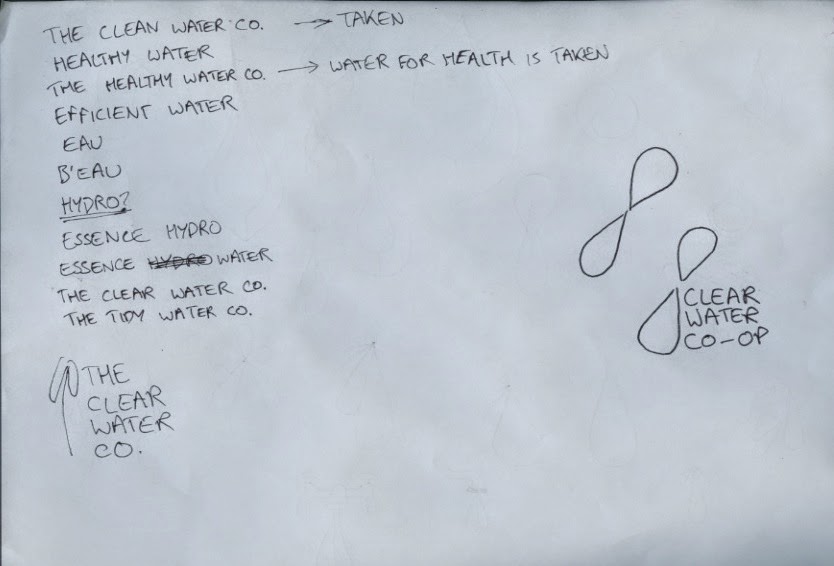
some logo idea sketches:
some name ideas:
Evaluation -
While the visual aesthetic of this brief was strong, I feel as though its application could have been broader and more personal, so as to give an indication what makes the brand different from other water companies. At the moment, it is just another water company.
The issue at the heart of this brief was that it was too theoretical. It is very hard to make design decisions when you are designing for a situation that can never occur. Water companies are entrenched geographically, and the only way for such a project to occur would be for an existing company to completely rethink its strategy. Despite this, the brief was interesting as it allowed me to consider a public utility as a product, which opens up new possibilities of analysis and communication.
What I have learned over the course of this brief is that for the ethos of a brand to truly be communicated, far more needs to be shown than simply promotional ephemera and logo application. The brand needs to be shown in action, with individual attributes clearly communicated through unique outcomes.
Subscribe to:
Comments (Atom)


