BA
(Hons.) GRAPHIC DESIGN
|
Level
|
6
|
Module Code:
OUGD603
|
Module Title:
|
Learning Outcomes:
|
BRIEF TITLE: DSM - WATER COMPANY BRANDING
|
Brief:
Create a set of branding for a water company. The water company can be municipal or private. Focus on what makes the water company a relateable service that customers can enjoy being part of. Think about what points of contact customers have with their water company, and how those points of contact can be more enjoyable.
By making the company a co-operative, and focusing on cleanliness of water, simplicity in billing and cost, the image of an ethically driven organisation comes to the fore.
|
Background:
Water companies are one of the semi private public services that people have little engagement with apart from the occasional bill. If dealings with water companies were mroe engaging, people would take a more active interest in understanding their water use.
|
Considerations:
While they are privately run companies, water utilities are not negotiable, you can't just change company. This means that while efforts must be made to make the customer experience as enjoyable as possible, little can be done to attract new customers. |
Mandatory Requirements:
Logo and identity communicated by a range of branding items. |
Target Audience:
Anyone looking for a new water company. This is a theoretical audience as you can't just change water company, however imagining that such actions could be carried out, those people would be targeted. This targets businesses and individuals alike. |
Tone of Voice:
Approachable and trustworthy, yet very professional and reliable. |
Deliverables:
Logo and brand application.
Development work.
Design boards.
|
Water Company
notes from presentation:
Build on concept of conservation and efficiency. Equate this to savings for the customer, and the environment.
Look at designing circular flows and promote responsible use of water.
Offer efficiency systems as an additional service, both for individual clients but also corporate.
http://www.waterlessuk.com/
BLUE OR NOT??
typical logos:
water diagram:
water company business card:
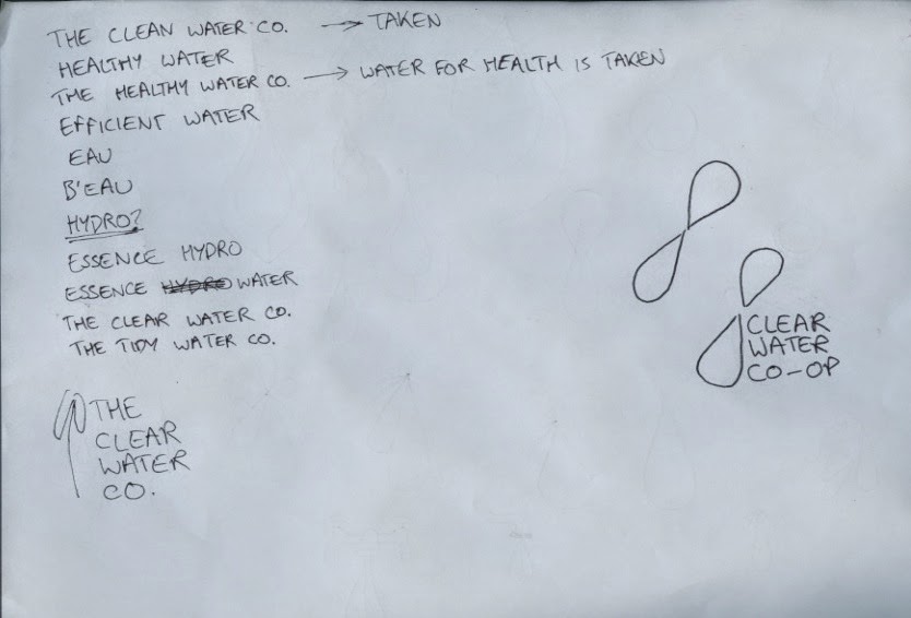
some logo idea sketches:
some name ideas:
Evaluation -
While the visual aesthetic of this brief was strong, I feel as though its application could have been broader and more personal, so as to give an indication what makes the brand different from other water companies. At the moment, it is just another water company.
The issue at the heart of this brief was that it was too theoretical. It is very hard to make design decisions when you are designing for a situation that can never occur. Water companies are entrenched geographically, and the only way for such a project to occur would be for an existing company to completely rethink its strategy. Despite this, the brief was interesting as it allowed me to consider a public utility as a product, which opens up new possibilities of analysis and communication.
What I have learned over the course of this brief is that for the ethos of a brand to truly be communicated, far more needs to be shown than simply promotional ephemera and logo application. The brand needs to be shown in action, with individual attributes clearly communicated through unique outcomes.


No comments:
Post a Comment