Brief:
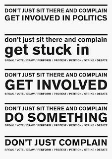
Create posters that encourage political participation through both conventional means (voting, petitioning, debating etc.) and less conventional means (protesting, activism etc.). The posters should not place emphasis on either conventional or unconventional means of participation, but rather should motivate the audience to simply want to get involved. |
Background:
In the run up to the election, it is increasingly easy for young people to feel disenfranchised by the endless spew of repetitive political lexis. This is particularly so when one considers that much of the rhetoric will ultimately amount to nothing. Despite this, there is a desire by young people to be more involved in politics. This brief is about tapping into that desire.
|
Considerations:
While it is important to break away from the redundant imagery and lexis typically associated with political campaigns, a fine balancing act must be undertaken as such imagery and lexis can be used as a means of relating the subject matter. Furthermore by clearly satirising such imagery and lexis, the general sentiment towards mainstream politics is expressed. |
Mandatory Requirements:
At least 2 posters communicating politically based messages encouraging youth involvement in politics. |
Target Audience:
University students of all backgrounds. Particularly those with some political knowledge who are disenfranchised with the current political system. |
Tone of Voice:
Firm and somewhat indignant, however with a satirical edge that doesn't take itself too seriously. |
Deliverables:
At least wo posters, print or web based (mocked up).
Supporting developmental material.
|
The aim of this brief is to encourage political participation. Whether this be through voting or other means is irrelevant, the point is that people do something.
The target audience for this brief is younger audiences over 18. This age category has the lowest percentage of voter turnout, and yet has the most to lose/gain through the implementation of political policy. It is therefore important that these younger people get more engaged with political discourse and ensure that their voices are heard.
voter participation by categories in 2010 :
https://www.ipsos-mori.com/researchpublications/researcharchive/2613/How-Britain-Voted-in
ARTICLE ABOUT LOW US PARTICIPATION
http://www.theguardian.com/us-news/2014/nov/05/midterms-youth-vote-drops-republicans-democrats
UK VOTER APATHY
http://survation.com/apathy-in-the-uk-understanding-the-attitudes-of-non-voters/
MADE UP WORDS FOR ONE POSTER OUTCOME:
http://www.buzzfeed.com/robinedds/17-made-up-words-all-twentysomethings-need-to-start-using#.bggD5Dn2d
http://uncyclopedia.wikia.com/wiki/Made_up_Words
good way of combining colour and text:
specific colours though?
here are some of the developmental designs:
Evaluation -
The main shortfall of this brief has been that it was not implemented properly. It would have been good to see the posters up around the university, as this would have allowed for a better understanding of their efficacy. While they were originally going to be displayed around election time, it became clear that knowledge about election time was already fairly high, and that the real issue was a lack of political motivation the rest of the time.
Conceptually, the posters had a lot of potential, particularly the 'more than 5 sides to politics' one, however unfortunately their execution was too slow and motivation was lost to continue them given the burden other briefs were placing on my time.
A lack of proper planning was one problem with this brief, while I sought to communicate cleverly considered messages to inspire political action, much of the development of these messages occurred on indesign and in my head, rather than in a sketchbook where the could be refined before application. If I were to do the brief in future, that would be the main thing I would change.
A further action I would do in future would be to extend the brief to include more material. While part of the nature of the message was that the audience are supposed to decide their own actions, it would be good to provide them with a starting point for those actions, in the form of a website, app, or publication. Such an outcome would also allow for a platform where actions could be shared and compared to one another.


.svg/2000px-Periodic_table_(polyatomic).svg.png)


