Brief:
Create a set of promotion and wayfinding that can be applied to the leeds college of art end of year show. Communicate the ethos of the college, particularly the extent to which the college functions as a whole. Design the outcomes to be placed on poster towers as well as in art/design oriented settings. |
Background:
End of year show branding is often relatively muted, this can be a good or bad thing. The work exhibited comes from all courses, and the exhibition is a representation of the college as a whole. This applies to the promotion for the show as well, as the college does not often take an actively outward role in promoting itself.
|
Considerations:
Balancing professionalism with enthusiasm for the work is a key part of the brief. Furthermore, the imagery has to stand out among the multitude of posters and other printed ephemera that are scattered around leeds. Generating the right imagery to compete with those ephemera while at the same time appearing professional is important. |
Mandatory Requirements:
1 A-format poster.1 postcard invitation. 1 e-vite mockup. wayfinding examples. |
Target Audience:
Prospective students, professionals within the creative industry, current students at LCA, and people in Leeds who may enjoy the show. |
Tone of Voice:
professional and unafraid to show work. |
Deliverables:
1 A-format poster.1 postcard invitation. 1 e-vite mockup. wayfinding examples. potential gifs any supporting ephemera boards |
After analysis of the briefs, it seemed prudent to look at previous themes for the end of year show/end of year shows of other universities.
Having considered the main attributes we seek to show about the college, we ascertained that the key ones were:
Variety in the types of people that are students.
Collaborative potential of different courses.
Our year are the new hot stuff, fresh off the press.
For that reason, and the varied visual potential of the theme, we went with the idea of presenting the college as a mad lab, where new elements are being created every year.
My task within this has been to create the wayfinding symbols that represent the courses. These can be used in the wayfinding but also in other elements of the proposal.
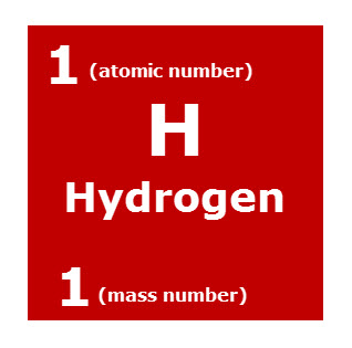
The symbols for the courses will be constructed and presented as elements are within the periodic table. This will allow for consistency across the theme but also adheres to the overall concept that the graduating students are fresh new elements on the scene.
Elements appear in the periodic table as seen below:
Colour codings refer to what type of element: noble gasses etc...
This image better illustrates the layout of individual squares:
Courses to create symbols for are:
Animation
Art & Design
Creative Advertising
Fashion
Fine Art
Graphic Design
Illustration
Photography
Printed Textiles
Visual Communication
Foundation Diploma
Extended Diploma
Access to Higher Education
gif:
Evaluation :
While the concept for this brief was strong, its application was poor. The possibilities created through the use of the LCA logo shape as an integral part of the imagery would have enforced the brand well, while at the same time creating a visually engaging metaphor for the collaborative work that occurs at the uni. The main reason for this poor application was the lateness with which it was carried out, and the fact that it was not going to submitted for the marketing board but rather used as a portfolio piece for jordan, joe, and I. However at the last minute we decided to complete it for them, hence the rushed and unrefined aesthetic.
I think the main reason it was not picked was that the imagery was too strong for the sort of refined look the college usually presents itself through. In the future I would have refined the imagery more, so that the conept is still evident, but does not overwhelm.


.svg/2000px-Periodic_table_(polyatomic).svg.png)


No comments:
Post a Comment