BA
(Hons.) GRAPHIC DESIGN
|
Level
|
6
|
Module Code:
OUGD603
|
Module Title:
|
Learning Outcomes:
|
BRIEF TITLE:PRINTED TEXTILES YEARBOOK
Brief:
Design
the yearbook for the graduating year of the Printed Textiles and
Surface Pattern Design course at LCA. Present student work to
prospective employers while also showing facts about the course,
achievements, and other information that advertises the high quality of
the course to prospective parents and students. |
Background:
While
some of the yearbooks in previous years have been of a good standard,
many have been barren and have left a lot to be desired. This is
particularly true of last year's, which had a pixelated front cover and
no page numbers.
Graduating
yearbooks are an excellent chance to show off the course to a variety
of audiences. As these audiences will likely be looking at other
yearbooks in making their decision about who to hire/where to go to
university, it is important for the finished piece to have its own
unique feel that sets it apart from the crowd.
|
Considerations:
Balancing
the two different audiences is a key role, however this can be
accomplished by ensuring that the work is presented as well as possible,
as this is an area which both audiences will look at. Furthermore,
considering that potential employers are not likely to read information
about aspcets of student lives, such an audience division will naturally
be addressed by the content.
While
it is important to ensure that the audiences are kept interested, the
views and opinions of the students themselves and that of the course
tutors must also be met. Furthermore, the aesthetic and image of the
college must not be strayed from too far.
|
Mandatory Requirements:
A print-ready document with all content reuired by the course that can be printed and bound by evolution print. |
Target Audience:
Potential
employers, potential students (and specifically their parents) and
industry professionals. Secondary audiences are other universities and
LCA itself. |
Tone of Voice:
Professional
and yet fun at the same time. It would seem that part of the course's
ethos is that the students and staff tryly enjoy themselves while doing
their work, and this must be communicated through the tone. |
Deliverables:
Printed and bound yearbooks. |
potential display fonts:
http://fontfabric.com/lovelo-font/
body copy and sub headers probably berthold akzidenz
looking at other printed textiles books:
http://www.textileartist.org/top-10-textile-printing-books/
tasks for this weekend:
split up music data into - artists/genres/types of music(ie:happy, dancey etc.)
break down day in the life into step by step recount of an individual day (include times/themes):
general themes:
a day in the life revolves around the central hub (the studio)
sense of community in textiles studio
bursting with all years in day or quiet and personal at night
always keep myself on the move, always active
narrative:
plan and develop creative thoughts and ideas in the busy studio
-drawing
-painting
tea break with my friends, allows me to unwind, catch up, and bounce ideas off other students
explore ideas through the workshops by experimenting with different techniques, materials, processes
go to lunch and debate with friends which sandwiches we prefer
see ideas start to become reality in the print room by printing, love having a tactile piece to hold and inspect once i'm done, allows me to reflect on my process and how it affects my finished work
deadlines! - hand in to duncan a project i've been working on, feel flood of relief
watch the studio go quiet at the end of the day, reflect on the acheivements and setbacks of the day and tie up loose ends,
FURTHER SOURCES FOR MUSIC GRAPHIC (BEYOND SURVEY):
http://www.bbc.co.uk/6music/programmes/schedules
http://www.bbc.co.uk/6music/playlist
http://www.bbc.co.uk/programmes/articles/lTSTgHn1zW3lY0TXg3dr98/6-musics-100-greatest-hits-the-top-100
After having joined the group belatedly, I joined the discussion about the aesthetic image we were aiming for, we looked over a variety of sources for visual themes:
while spot colours would not be used as process colour has to be used for work imagery, the use of a prevaling single colour throughout the publication is something we have al agreed will look good and communicate a consistent tone.
use of hand rendered tpye at large sizes below is desirable, creates personal aesthetic.

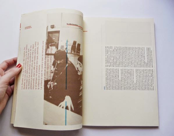
use of textured hand rendered type below is similar to style we seek to emulate:
type and image as we are considering it:
the wraparound cover would look something like this:

however over a detailed cover such as this:
i did some margin tests to work out where best to place them:
development sketches:
planning and prep:
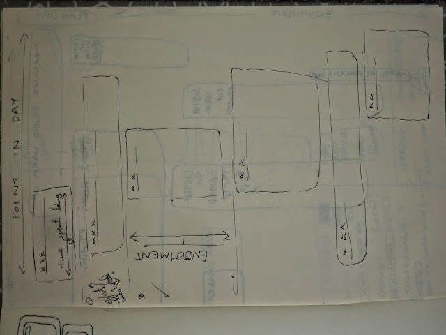
during the developmental stage of the day in the life spread, i begain playing around with creatin a chart for how the day is spent.
in the end it became clear that this style of design was inconsistent with the rest of the book, and that a simpler format of plain lines of text worked better to quickly communicate the facts. after all, there is no point communicating comparative data when all that is needed is a quick indication of content.
music spread development:
here are some of the trials i did for the wraparound section :
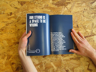
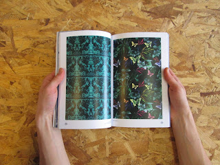
photos of printed mockup:
Evaluation -
This brief has been a real eye opener for how to work in a group on a large project with a lot of client involvement. Continual meetings and assessment of goals, shortcomings and successes have been key to this working.
I really enjoyed this brief, as it gave insight into how to work in a group, but also into how the printed textiles course works. it has been educational to be in their studio and understand the group dynamic, as well as their teaching methods. They are very different from graphic design, however they share the same hard working ethos.
While i initially had reservations on the jungle-style theme, it has come to fruition very well. Through minimal application of visual clues, it has been possible to subtly influence the overall tone and aesthetic to create a more fun approach, yet still maintaining the professional dynamic required of a course yearbook.
If there was anything i would do differently in the future it would be to do more. While i have made a fair contribution to the group, i feel as though some of the more time intensive tasks, such as typeface creation (which was eventually scrapped), student work management, and illustration.












No comments:
Post a Comment