Rewritten brief:
Brief:
1. Create a vinyl cover for evian christ's album Duga-3. Listen to the song and communicate the atmosphere created by the music, combined with the associations of a Soviet Union radio installation.
2. Create a poster for Odonis Odonis' performance on 18th of April. Have a look at their other poster and promotional imagery to get a feel for the kind of thing they do.
3. Do something that communicates what you are about. |
Background:
1. Duga -3 is a massive Soviet radio installation. The distorting qualities of this feature in combination with evian christ's sounds, and were an inspiration for the mix.
2. Odonis Odonis have a history of psychedlic inspired and visually strong artwork.
3. Me!
|
Considerations:
1. Evian Christ produces very abstract music, so don't get too bogged down on the details.
2. The gig poster has to appeal to the Odoni Odonis' core fanbase, but also attempt to draw outside listeners in to the gig.
3. Do what you want. |
Mandatory Requirements:
1. One vinyl cover ready for application.
2. One poster ready for use.
3. A 2-d 23cmx16cm outcome.
|
Target Audience:
1. People who might buy the record, evian christ fans, vinyl junkies etc.
2. Fans of the band, fans of saint coltrane, potential giggers.
3. Anyone and everyone.
|
Tone of Voice:
1. Weird like the music.
2. Psychedelic and somewhat wild, indicative of a stellar performance.
3. Personal and simple. |
Deliverables:
1. One vinyl cover ready for application.
2. One poster ready for use.
3. A 2-d 23cmx16cm outcome. |
Initial brainstorms for each brief:
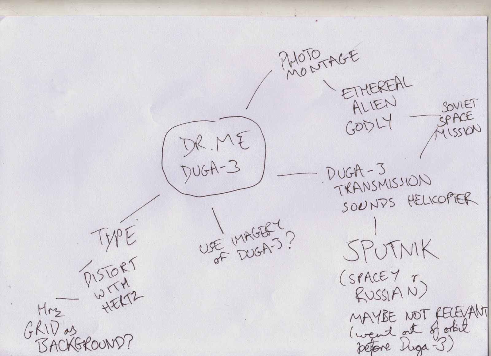
For the Duga-3 brief, we had the initial idea of using imagery of the Sputnik satellite, as this was an iconic example of Russian science and the space-age. We planned to incorporate the fluctuations found in radio wave charts into the photography of the Sputnik. Some of my initial sketches and ideas are here:
Unfortunately despite the visual qualities of the Sputnik photography, it was somewhat irrelevant, and the idea was scrapped in favour of the type-led idea. My partner (Kirsty) initially carried out those ideas, however I thoroughly enjoyed the concept of breaking up type in a similar way that radio waves are displayed, so I created one as well.
Sourcing a graph as a background was one of the more difficult parts, as despite there being a variety of grid images available on the internet, there were few that had multiple increments included (eg mm and cm) without specifying what they actually were.
Below is an example of the exact grid style I wanted, however the one shown was .svg format (used by wiki) which photoshop does not support for some reason.
here is another image that was perfect, but it was too small:
I ended up creating a grid in photoshop using the pencil tool and a lot of copy and pasting.
Vertical distortion:
With original text:
Horizontal distortion:
With original text:
Everything:
Final outcome without colour:
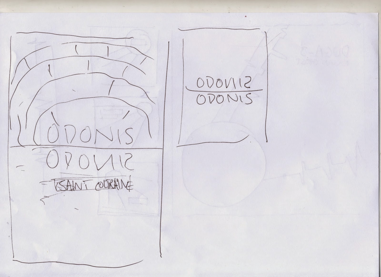
After reading through the brief, an initial concept of my partner (Kirsty) for the second brief (poster) was to use the duplication of the word Odonis as a reflection. We agreed that I would consider this avenue and try to create some outcomes. This would then form the central part of the poster, with the other information falling below this central feature. This would also allow synthesis between background imagery and the type used in the poster. Finding an image to be used was difficult due to quality issues and finding an appropriate image of a flat horizon with water.
Initial idea:
I found an image from when I was on holiday in Morocco this summer, and we used that.
Original Image:
Manipulation attempts:
The issue with these trials was mainly that the use of a CMYK palette meant that the image was somewhat unordered. I then attempted to use a duotone palette to achieve ideal colour:
After having settled on a duotone setting for the background image, I began to add the text.
A key issue with the text was that the visual qualities of the background image made it harder to read the text. Adding transparent bounding boxes between the text and image allowed for greater legibility.
Screenshot of final outcome for poster:
During the design process, I printed a few trials out of the poster at A4 scale to test colours and transparencies (which affected legibility):
In the final half-hour of the workshop session, I addressed the issue of my self-directed art piece:
Having heard DR.ME talk so fondly of using hand-rendered method for design production, I decided to create something without involving digital processes. The finished piece was meant to mimic no-smoking signs in terms of it's presentation. The small format made this particularly easy, as many no-smoking signs are about this size.
Scan of drawing:
If there was a caption for this image, it would read : "Don't let your thoughts ruin someone else's day."
Evaluation
Overall, I am happy with the outcome of this brief. More so with Duga 3 and the personal art brief, as these really communicated the message at heart. The odonis odonis brief was more of an aesthetically lead one, however it was still clear to the point and suited the previous promotion of the brand.
It was interesting and fun to work with kirsty on this brief, particularly as we both have a different style of working. Despite this, the method we chose to work, by which we each each set about creating one piece individually, while conferring with each other as well, proved not to be very collaborative, and this shows in the difference of the work we produced.
I found this brief very enjoyable and Dr. Me very friendly and helpful. In future I would maybe try to extend it across a range of items to make a fuller set of work from it.


No comments:
Post a Comment