Brief:
Design
the logo and identity for Totem Audio, a new bass music night club event opening in Leeds. After this has been developed, apply the logo and identity to printed promotion (namely fliers) and web presence, such as facebook pages, facebook event pages and soundcloud accounts.The brief will be carried out with joe, and is for some friends of ours. |
Background:
Leeds is overflowing with nights and events targetted at students, and so standing out among the multitude of promotional material can be very difficult at times. Bold forms and colours will have to employed to ensure that brand recognition is achieved. |
Considerations:
Consider the failures of the previous work joe and i did for these clients, namely that there was too much nois and distraction from the information and forms. Be sure to be more firm in implementing design decisions, that was one of the pitfalls last time, that the client was given way too much freedom, which ended up hindering the brief. |
Mandatory Requirements:
A logo and identity.Printable fliers ready for litho. Web images ready for application |
Target Audience:
Students in Leeds. |
Tone of Voice:
Professional
and yet fun at the same time. It would seem that part of the course's
ethos is that the students and staff tryly enjoy themselves while doing
their work, and this must be communicated through the tone. |
Deliverables:
Printed and bound yearbooks. |
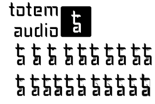
As the client had previously done a night we had worked on lsat year and had enjoyed the use of logotype, we based the logo on the same typeface.
we realised that the initial glyphs combined seemed to make a totem face.
i then spent time trying to make the face more recognisable. in the end however it was not used.
after scrapping the logo above, joe drew out a totem, which i vecotrised into what is seen below:
Though the logo was too complex to function well at small sizes, we went with it anyway due to a lack of time.
FLIER DEVELOPMENT
Evaluation :
I have been more happy with this brief than the previous year's work for this client. However, it is clear that certain decisions they were allowed to make should have been made by us, and we should have put our foot down. One example of this would be the constinued use of the gradient backgrounds. While originally such action was a useful way of working with the facebook platform, in hindsight a more muted background could have been found.
If I were to do this brief again, the main thing I would do is make the illustration more available in the web presence. Joe did some very strong illustrations for the brief, and it was foolish to only apply it to the flier. While we thought that due to the distinctive nature of the type and colour etc, people would make the connection, however maybe this was not so.
A further issue with the brief was the choice of printers. Despite having issues with the printers we used before, the client decided to return to them as they were the cheapest. This reaffirms the notion that you get what you pay for, which is particularly evident with the last set of fliers, which have a line through them that was not included in the original document.
This brief has really helped me to understand how to manage clients while doing jobs. This is particularly true as the client is my friend, and having such a relationship clarifies the interactions you have. That said, working with your friend as a client is incredibly frustrating, as it is far harder to tell them to scrap an idea, or outright refuse to do something.


No comments:
Post a Comment