BA
(Hons.) GRAPHIC DESIGN
|
Level
|
6
|
Module Code:
|
Module Title:
|
Learning Outcomes:
|
BRIEF TITLE: ECUMENU
|
Brief:
Supply recipes to a younger demographic
of cookers through both print and web-based outcomes. Recipes will cater for
both vegetarian and carnivorous diners, and should aim to encourage audience
involvement in online material through the distribution of printed recipe
fliers.
|
Background:
There are a variety of books and websites
that target recipes and other cooking material at younger people (usually
around the 16-25 age bracket). Despite the large volume of available material
of this nature, many people within the target age bracket do not use it. This
is largely due to the costs associated with printed books but also due to the
poor promotion and inappropriate tone of voice of the material itself.
|
Considerations:
The tone of voice for a project like
this is incredibly important. Avoiding the condescending nature of previous
cooking material targeting this age bracket is absolutely essential; as this
is one of the main reasons previous work in this area has been so
unsuccessful. A good synthesis between print and web is another important
facet of this project, as the audience experience will ideally involve an
exposure to printed material prior to use of the website.
|
Mandatory Requirements:
At least one double-sided recipe
mail-out (ideally a few).
Final website proposals with all web
pages prepared.
|
Target Audience:
Younger people (aged roughly 16-25),
many of whom may be students.
The specific audience is people of the
aforementioned age who are not particularly confident in the kitchen, and
could use some recipe ideas to spice up their cuisine. It must be stressed
that this project is not targeted exclusively at those who cannot cook, but
rather at young people as a whole, some of who may be perfectly capable in
the kitchen.
|
Tone of Voice:
Adult and professional with a light
touch. Lexis should avoid trying to engage with colloquialisms and instead
should allow visual features to communicate relaxed tone.
|
Deliverables:
Primary and secondary research.
Design boards.
At least one finished double-sided
printed flier.
Digital website proposals.
Web scamps showing user flow.
All developmental sketches, mock-ups and
trials.
|
To accurately analyse the best ways of appealing to a younger audience, perhaps it would be good to look to how others have attempted to do this in the cooking industry and have failed.
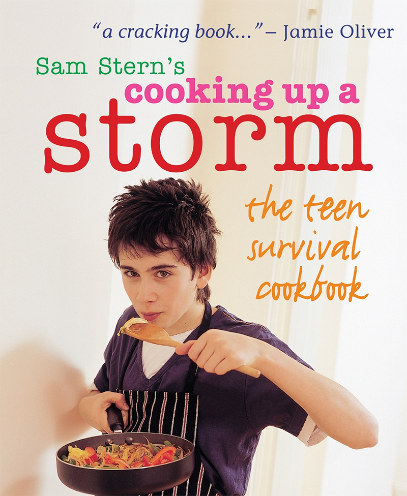
One of the worst attempts to captivate a younger market has been the Sam Stern cookbooks:
While the target audience for this book is a somewhat younger one than in my brief, there is a small overlap, and this book epitomises everything that should not be done when marketing something to younger people.
The website is shown here:
Minimal aesthetic tries to be overly approachable with muted colours.
This is how recipes are laid out, again, the same overly approachable aesthetic is used. Such an aesthetic has NO JAZZ.
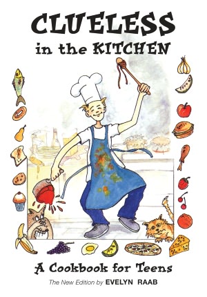
An even more ridiculour aesthetic can be found in the Clueless in the Kitchen book, which seems to be aimed more at children than teens. Again, I am aware of the difference in target age from this and my project, however it still bears relevance as an aesthetic that should be avoided.
Having looked at the absolute worst in the field, it is time to examine works which have some redeeming features, but still manage to alienate the target audience somewhat.
Here is a cookbook that targets a more similar audience to my project. The aesthetic for this however lowers its tone somewhat which makes it less appealing, however there is a good synthesis between the vegetarian and meat-eating editions, particularly regarding colour. Despite that, naff slogans (don't leave home without it) would immediately turn the target audience away from it.
Web aesthetic:
Attempts to synthesise colour difference between veg/meat editions have failed miserably. The recipe section shown below is exceptionally weak, as they want people to buy the book:
THROUGHOUT MY RESEARCH THERE SEEMS TO BE LITTLE SYNTHESIS BETWEEN WEB CONTENT AND PRINTED BOOKS, EITHER THEY WANT YOU TO BUY A BOOK AND DON'T BOTHER WITH WEBSITE OR THEY ONLY USE QUICK WEBSITE.
website for cookbook:
http://www.studentbeans.com/
website not even related to cooking, just general student website.
Website which came up in my searches for other books:
http://studentrecipes.com/
This too falls into the trap of trying to be too fun and friendly. Content is free and website seems to be funded from advertising. Recipe page is not engaging and brief, although so is recipe so maybe that is why. Markets itself as quick easy recipes, no depth.
As part of the brief is the focus on balanced meals with healthy (ish) ingredients, I feel I should examine how healthy cookbooks and websites attract customers.
BBCs food website's section on healthy eating:
http://www.bbcgoodfood.com/recipes/category/healthy
within the broader term of "healthy" food, the BBC have compiled different healthy eating collections.
The categories/lists are laid out below:
Consistency throughout website is strong, however the aesthetic, like many other healthy eating websites, is very clean and minimal. Abundance of use of white suggests to me a level of blandness.
Part of the reason for this clean cut minimal approach is that many people trying to eat healthily are trying to lose weight or are on a diet for other reasons.
Some lists of healthy/diet cookbooks (important to note I am not making a diet book, but similar audiences apply so good to look):
http://www.allaboutyou.com/food/wisdom/10-best-healthy-diet-cookbooks
http://www.amazon.com/Top-10-Bestselling-HEALTHY-Cookbooks/lm/R27WBY9M5JIP70
http://www.huffingtonpost.com/cooking-light/healthy-cookbooks_b_1194364.html
http://greatist.com/health/best-cookbooks
interestingly the lines between a dieting cookbook and balanced diet cookbook are somewhat blurred, despite a clear difference in meaning. Perhaps one of the reasons healthy cookbooks are so unappealing is due to this conflict of goals.
Among those lists above, the healthy college cookbook shown below is one of the few targeted at younger audiences. Despite this, the aesthetic is unpleasing and the tone is somewhat condescending.
One of the reasons such attempts to attract younger audiences is so ineffective is that material clearly states it is aimed at younger audiences (in this case college students). As many young people (often wrongly) feel they are broaching new grounds of maturity when they go to university, such an aesthetic is clearly unhelpful, and pushes students away. For this reason, one of the most important parts of my project is ensuring that while students are targeted, there is no obvious indication of this in the promotion and tone.
NEED TO LOOK AT UPMARKET RECIPES
One of the most important parts of my project is the idea of a balanced diet. This will be reflected in the recipes, however having done some research I feel as though such a theme should be adopted as a broader part of the brand concept in general. Such an emphasis allows a shift from the usual diet-lead healthy eating, and is a subject which many students have interest in as they start to lead an independent adult life.
what they want:
chicken catsu curry
something simple (can be made with minimal ingredients)
falafel burgers
oreo truffle
mac cheese
an easy curry
stir fries
goats cheese deep fried in batter on a bed of cranberry sauce
goats cheese and honey tart
stuffed potatoes
stuffed mushroom
stuffed anything
tajines
fajitas
proper salads
chocolate fondant
bessie's cheesecake
jacket potatoes
pitta/naan pizzas
chilli jam they use at ciabatta
-- say they think interesting recipes with simple ingredients would be good as many students don't have a wide variety to choose from
they want international!
give it to them!
http://www.epicurious.com/recipes/food/views/Ful-Medames-Egyptian-Brown-Fava-Beans-352993
http://www.cookingchanneltv.com/recipes/best-international-recipes-global-and-cooking.html
http://www.thegutsygourmet.net/
http://www.whats4eats.com/regions
http://www.internationalrecipes.net/recipes/advanced.pl
http://recipegoldmine.com/world/world.html
International Names:
taste visa
culinary traveller
flavour holiday
taste holiday
food journey
taste journey
taste traveller
flavour voyage
travel-eat
holiday gourmet
holidet gourmet
holiday gourmay
global recipes
global foods
global munchies
global food co.
global recipe co.
global flavour co.
global eats
holiday food
holiday munchies
global food emporium
global recipe emporium
global recipe outlet
global recipe market
earthly eats
worldwide slice
ecumenical flavours
cosmic eats
global menu
ecumenical menu
menu ecumen
global slice
global peel
GLOBAL RECIPE CO.
the flavour encyclopaedia
ecumen
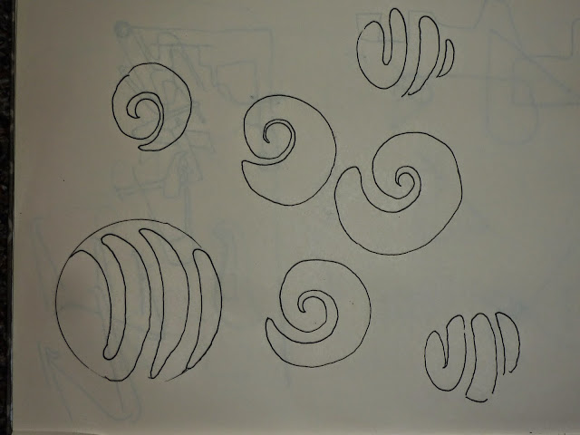
decision must be made on the design of the logo, either:
a sliced globe
or
an orange peel globe
developmental sketches have proved inconclusive
INSERT sketches
searching for online imagery has revealed that the sliced globe is pre-exisiting, although this was the only image of it initially available:
the globe orange peel is less obvious, although this did come up:
the main issue with the orange peel globe is that for it to be consistent across the whole piece, it requires the inside of the skin to be of a certain shade.Furthermore, a sliced globe should convey solidity better and be more recognizable as an icon.
initial recipe cards to create from what I think people will want -
lebanese
thai
brazilian
moroccan
initial recipes to create from what other people have said they want -
Lebanese, Thai & Moroccan
Italian, Japanese, Thai
Thai!
Thai, Moroccan, French
Thai, Vietnamese, Indian
Japanese, Thai, French
English, Japanese, French
Spanish, Thai, Caribbean
Swahili, Australian Aboriginal, Siberian Russian
Italian, Spanish and Japanese.
Morrocan, Indian, Greek
Indian, Spanish, Thai, Vietnamese
Indian, Italian, French
INCLUDE NAME OF COUNTRY IN NATIVE SCRIPT - ADDS ELEMENT OF AUTHENTICITY TO CARD
lebanese will be first card:
potential veg recipe:
baba ghanouj
fuul
potential meat recipe:
kefta
mulukhiya
daoud basha
http://marmadukescarlet.blogspot.co.uk/2013/01/claudia-rodens-daoud-basha-lamb.html
thai will be the second card:
potential veg recipe:
hot yellow curry
braised plantain with that spices
green papaya salad
thai green vegetable curry-
http://www.jamieshomecookingskills.com/recipe.php?title=thai-green-vegetable-curry
potential meat recipe:
gai med ma mong-
http://highheelgourmet.com/2014/02/01/chicken-with-cashew-nuts/
som tam
pad thai
greek be the third card:
potential veg:
horta vrasta w/ rice
fassolatha w/ bread
spanakopita
potential meat:
pastitsio
keftethes
souvlaki
indian:
veg -
http://www.vegrecipesofindia.com/tomato-pulao-recipe/
meat -
http://food.ndtv.com/recipe-teekha-murgh-176536
FIRST THAI NAVIGATION MENUS WILL NOT UPLOAD FOR UNKOWN REASON
Evaluation
Overall, I am very happy about how this brief has turned out. I feel that the cards communicate the recpies clearly, and that the hurdle of how to arrange the type for the ingredients so that it is clear and yet engaging has been surpassed.
One issue that i would change if i was to redo the brief has been the photography of the printed material. While at the time it seemed that a brown/grey background would allow the vibrancy of the national flag colours and pure white of the stock to become more apparent, however instead it seems to have detracted from that somewhat.
I feel that the strongest part of the brief has been the user interface for the website. If a developper was to be found to code it, I would seriously consider attempting to set a company up. As it happens my godmother has been considering working collaboratively on the release of a cookbook in the US, so i will propose it to her and see what she thinks.
What could have been extended with the brief was the promotional range. The poster did not match the fliers/ingredient cards, and posters would be better employed in the future through the use of the same colour schemes as the flags. Another area for extension would have been an app, maybe that will be part of my proposal...


Thank you for this information. There are so many benefits of vegan meat which will help us to be healty.
ReplyDelete