BA
(Hons.) GRAPHIC DESIGN
|
Level
|
6
|
Module Code:
|
Module Title:
|
Learning Outcomes:
|
BRIEF TITLE: SOLAR BRAND
|
Brief:
Create a comprehensive identity for a
solar panel company. The identity should include branding across a variety of
business items, and should encourage sustainable behaviour where possible
through the use of sustainable materials and engaging design.
|
Background:
Sustainable energy production is a
sector which is constantly growing. Solar energy is the most easily
accessible form of renewable energy to small-scale consumers. This is mainly
due to the variety of sizes available and ease of installation but also due
to advancements in technology which are making solar panels more and more
affordable.
Despite these developments, there are
still many who do not consider solar power as a feasible source of energy,
and feel that solar panels sit firmly within the realm of wealthy
environmentalists.
|
Considerations:
It is important to ensure that
sustainable materials and processes are used where possible to create the
branding for this company, as this stresses the sustainable identity of an
organisation dedicated to supplying renewable energy sources.
Solar panel use is more common in rural
areas.
|
Mandatory Requirements:
A full identity and concept behind the
brand of the company, including: logo, colour schemes, ethos, typefaces
etc.
Consistently branded business items to
be used in the day to day running of the company, including: business cards,
letterheads, invoices etc.
Brand guidelines for the use of the
company’s identity.
|
Target Audience:
The target audience for branded
business items will naturally be clients of the company. These may be
commercial clients involved in the production or distribution of solar panels
or this may simply be a customer. For this reason targeting the branded
business items to a specific demographic is somewhat difficult.
Despite the difficulty of targeting
branded items, it is fairly easy to consider a target demographic for the
brand as a form of promotion to customers. Solar panels are still not overly
cheap; therefore customers will probably have some measure of disposable
income. For this reason the identity will not target under 25 year olds.
|
Tone of Voice:
The tone of voice throughout most
branding should be professional and clean. It is important to distance the
company from the stereotypical image of ‘tree-hugging’ environmentalism, and
instead present itself as a modern, efficient company supplying a useful
product which can ultimately save money.
|
Deliverables:
Full identity and brand concept.
Range of branded items for practical
use in the running of the company.
Brand guidelines document.
Design boards.
Mock-ups and trials testing different
printing methods and sustainability.
|
Having drafted the brief, it is important to decide what solar panel company to brand before preparation and work can be done.
Some solar companies:
list of various smaller solar panel companies by area : http://www.freeindex.co.uk/categories/arts_and_lifestyle/diy/solar_panels/
http://www.solarcentury.com/uk/ - already has comprehensive brand.
http://www.nws.co.uk/solar/ - this is the sort of weaker brand I seek to remake, however this company seems to deal only with installation as opposed to selling panels as well.
after reviewing solar panel companies around the UK, I realised that it makes more sense to brand a company in Leeds, as I will be able to carry out research and contact more easily.
list of solar panel companies operating in Leeds: http://www.solarguide.co.uk/location/west-yorkshire/leeds/
http://www.leeds-solar.co.uk - ideal as has poor branding and is local, could pitch to them…
http://www.ghsustainability.co.uk - also good due to locality, branding strongish already so less likely to adopt.
http://www.solec-uk.com/#&panel1-1 - good but brand is strong and company is part of larger constructing consultancy

Initial analysis of the company's brand makes it clear that company brand is lacking in engaging features. Logo leaves a lot to be desired, and plain green colour scheme plays towards negative stereotype of environmentally friendly companies.
A further area for development would be their pricing indication chart:

A further area for development would be their pricing indication chart:
A key aim of this rebrand is to produce a consistent range which could actually be adopted by the company. After completion I aim to pitch the finished work to the company.
To begin the branding process, I drew out logo variations that could be used as the base of the rest of the brand.


In deciding what forms of branding to apply to the identity, I drew up a brief brainstorm focusing on some of the main options:

To help inform the development of the logo, I regarded the features of logos of other solar power companies:

As one would expect, the sun or a solar panel seems to be the only visual feature in nearly all of the logos shown. While such visual features make it clearer what the company does, it puts the company at risk of blending in with the competition.

Logos of other solar companies in and around Leeds:


Naturally some of these logos belong to a larger conglomerate which has a branch in Leeds, however it gives a good indication of the visual features of local competition. Again there seems to be a large focus on green colours with an emphasis on the shape of the sun.
To get a good idea of solar branding concepts, I looked at some more which were visually stronger:


Some branding and identity briefs which maintain a strong concept throughout their work:
Hotel Ambrose - makes good use of the brand across hotel media.


Bass Pro Outdoor Shop - good use of textures and imagery to enforce concept of outdoor living. Also resourceful use of branding across content specific media (for example the slingshot).


Desk Idea - keeps to strong concept of minimalism from start of consumer experience to finish. Idea of continuity throughout consumer experience is something I seek to exemplify in my work. From going to Leeds Solar website right until the engineer has installed a panel, the brand should be strong. Pencil/logotype very relevant to content.


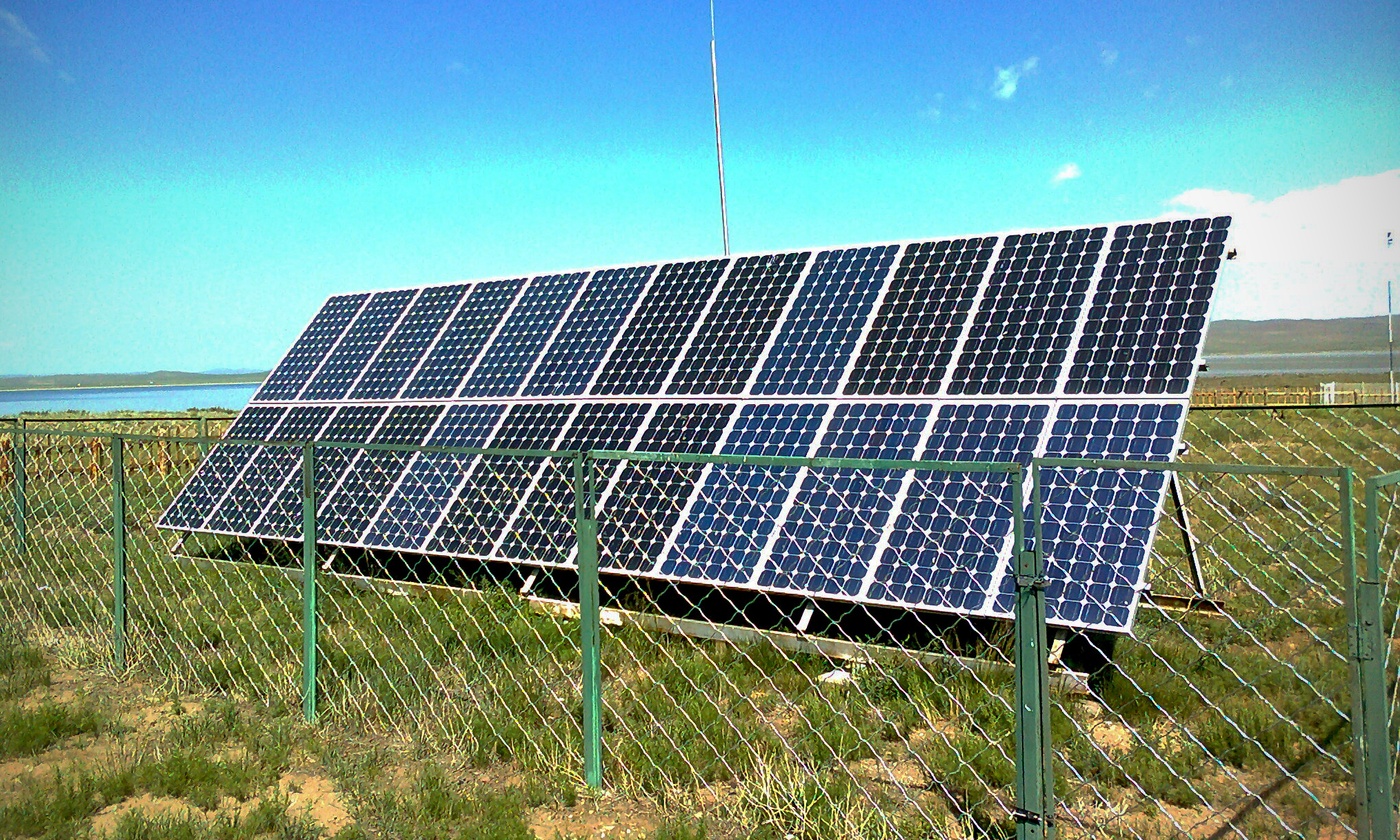
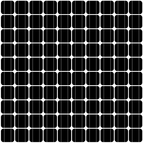
As I develop an identity for the brief, I feel I should look at the visual features of solar panels for inspiration.


As one of the key areas of a business such as this is invoices, I have looked to invoice templates to see how they are ordered:
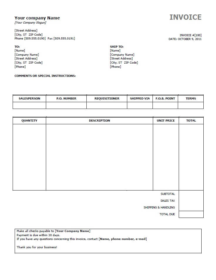


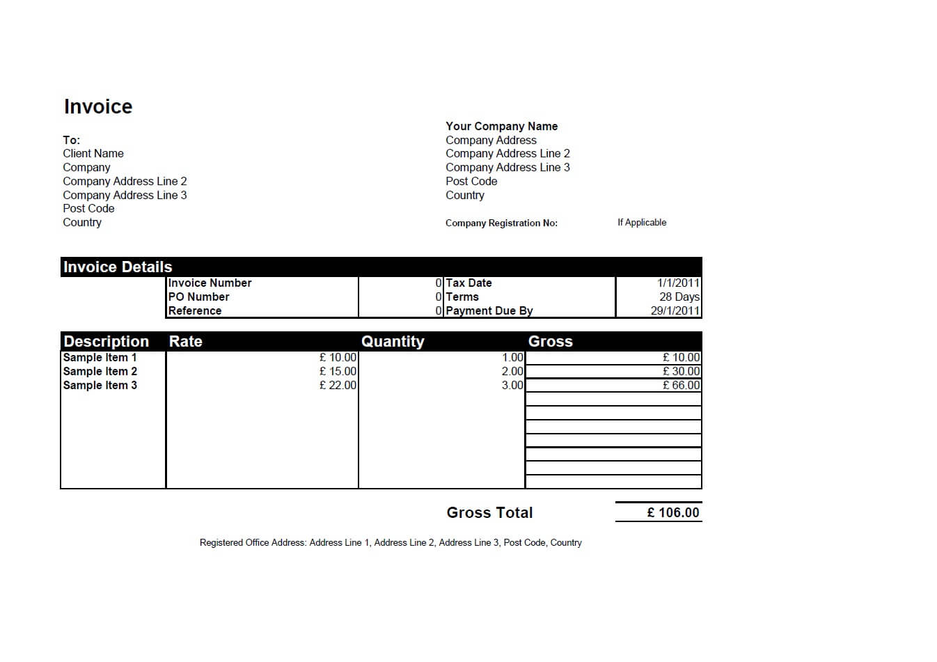
Now to examine some invoices for solar panel companies:
Information about solar panels, examining how it is presented will make it easier for me to do so well.

compliment slip examples:

In considering the website design, I thought to use the solar panel pattern as part of the theme. Here is an example of solar website brief which has done this. Unfortunately the offset angle makes layouts seem somewhat askew.

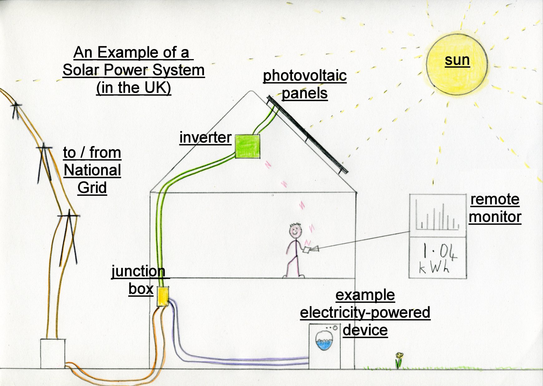
in the creation of the homepage, i found there was a need for visual features beyond photographs of solar panels. Some sort of diagram showing how solar panels work seemed to be the most imagery to include.
Some diagrams I found:


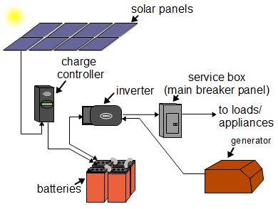
having looked at these and other diagrams, I realised there may be some difference between UK systems and others, so specified UK diagrams.


I am also considering creating a diagram of how solar panels work within the solar panel. Such diagrams would be far more complicated, but may inspire potential customers to take an interest in solar panels.

After having taken a hiatus from progressing through this task, I looked on the website to assess the best way to proceed, and realised that it has changed. While the poor aesthetic and confusing layout are still there, the drop-down menus have changed, as has the home page (to some extent).

Furthermore, at the bottom of the home page, it says *February 2015 - this website is being upgraded*. This suggests that the leadership of the company has finally realised that their website and branding are of an unacceptable quality. While, if the project was finished, this would be good for me as it would indicate a willingness to accept new designs, unfortunately it signifies that the creators of the website are still available, and have been enlisted to update it. Unfortunately this means that the same aesthetic will probably be kept.
For these reasons, it is clear that my previous approach of tailoring my designs to the current brand/website has become redundant. Considering that this approach lead to nothing, this could be a good thing. I will now revert to my original identity based upon solar cells with type. This sets a far more fresh tone, separate from the typical sun oriented imagery of other solar companies.
One immediate shift is to use Berthold instead of Avenir as the typeface. Despite Avenir's attributes when printed, after using it as a screen typeface, i have realised it is not ideal.
A consideration for the home page is facts about solar power (DOUBLE CHECK STATS):
solar pv prices drop 60% since 2010.
98% of surveyed solar pvs achieve predicted targets according to sheffield university survey.
earth receives about 1,366 watts of direct solar radiation per square meter.
solar panels today are about half the price they were in 2008.
4kWp system can generate around 3,800 kilowatt hours of electricity a year in the south of England – roughly equivalent to a typical household's electricity needs. It will save nearly two tonnes of carbon dioxide every year. A 4kWp system in Scotland can generate about 3,200 kilowatt hours of electricity a year – more than three quarters of a typical household's electricity needs. It will save more than a tonne and a half of carbon dioxide every year.
Evaluation
This brief has been a quagmire of indecisiveness. Rather than setting out whether i wanted to radically change the aesthetic and tone of the company or maintain a similar one, i floated between the two extremes, unsure which route to go down. This wasted a huge amount of time and effort. In the future, efforts would be made to clarify this at the beginning.
Overall I am happy with the finished aesthetic of the brief aside from the colour. I feel as though the colour could have been somewhat more dynamic. I would like to have printed the branding ephemera out for real so as to give a real indication of how it would look and feel, but time constraints prevented me from doing this or even mocking it up.
One aspect of the brief that really excited me was the use of information to engage the audience and promote the goods of the company. By being clear and concise and impartial (to some extent), a level of trust is created between the company and its target audience. Furthermore, the audience might actually learn something!
No comments:
Post a Comment